

To make the composition more solid I decided to add a frame.
Detail is key.

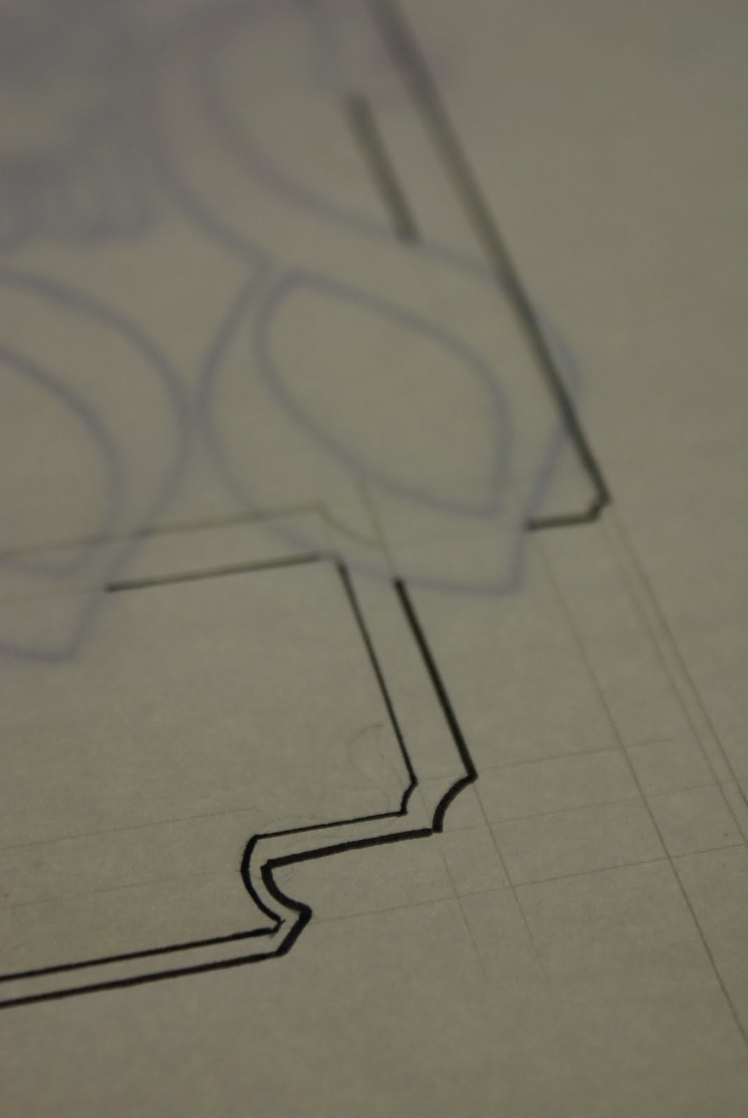
Areas which had unused space were easily filled by shapes added onto the frame.

Once the frame came together I started to play with shadows which gave the frame more character and not so flat.

One thing was key that the type stayed legible.


More detail. I added Tudor Wholesale Foods logo to the bottom of the composition.


In his own little world.

Including The companies Name, logo and business start date really personalised the composition.

You cant beat pencil.


Adding more detail is possible, however it needs to be as legible as possible and this could loose it.

And again on the frame work, but this seemed to bring the type forward.
No comments:
Post a Comment